接下来的topic进入multimedia相关的知识,也会学到很多seni相关的东西。拿的course有包括seni或者SPM拿过seni的读这个chapter会比较快理解。
要学的topic:
1. Principles of Design Organisation (完)
2. Elements of 2D Design (完)
3. Elements of 3D Design (完)
4. Elements of Multimedia (待更新)
5. Features of User Interface Design (待更新)
PDF版本自行到以下网址export自取:https://adorable-consonant-b52.notion.site/Multimedia-Design-242d8737bbf54d99a3cb80ca14329707
有问题可联系:mithizwen@gmail.com
-----------------------------------------------------------------------------------------------
Principles of Design Organisation
Harmony
- The related qualities of visual elements in a composition.
- Can be achieved through the repetition of individual Art Elements.
//看整体design和不和谐。一个design可以说是harmony只要没有一个东西过于突出,过于不一样。只要一眼看过去,没有一个东西一下子捉到你的眼球,就可以说是harmony。
Variety
- The use of opposing, contrasting, changing, elaborating, or diversifying elements in a composition to add individualism and interest.
- To avoid monotony, boredom, and dullness.
- Use in two ways:
- First,find variety in opposition or contrast to create unity.
- Second, they elaborate upon forces which are equal in quantity and strength.
//variety顾名思义就是不一样,差别性。一个design的形状,颜色,纹路不同就算有variety。
Balance
- The feeling of equilibrium in weight, attention, or attraction through the various uses of the visual elements within an artwork as a means of accomplishing unity.
- Types of balance:
- Visual Balance: Pleasing to the eye, a feeling of good arrangement。
- Formal Balance: Equal or similar elements on opposing sides of a central axis.
- Symmetrical Balance: is a mirrored image.
- Radial Balance: is symmetrical with elements starting from a central point.
- Informal Balance: The feeling of balance using unlike objects.
- -Asymmetrical Balance: When creating a composition, the careful arrangement of visual weight.
//关于balance,知道symmetrical和asymmetrical就好。
Proportion
- The size relationship or ratio of one picture part to another or one object to another.
- Ratio implies comparison and is expressed in size, number, position, and shape.
Dominance/Emphasis
- To make one part of an artwork dominate over the other parts. Some features are emphasized and others are subordinated. A Focal Point or Center of Interest is established
- By artists using emphasis to draw the viewers eye to that part of the artwork in these ways:
- Contrast: Placing opposing elements near each other. (i.e. bright color surrounded by dark color)
- Isolation: Placing one object apart or alone in a design draws the eye to it.
- Location: Placement near the center (left or right, above or below) is a natural emphasis.
- Convergence: Subtle arrangement of elements pointing to one item.
- The Unusual: An out of the ordinary object or unexpected one can become the focal point.
//当你觉得这个design有一个东西非常突出,一眼就看到,可以说这个东西就是这个design要注重的地方,这个design有用到dominance。
Movement
- The visual effect where the eye is helped to move around the artwork.
- Because a picture surface is static, any animation must come from the illusion an artist creates through the placement and configuration of the picture parts.
Economy
- The simplification of the objects and elements in a work.
- Helps to strengthen the conceptual and organization aspects of an artwork.
- Somewhat a degree of Abstraction.
#图片来源:https://design.tutsplus.com/articles/the-principles-of-design--cms-33962
#常见的考题方式:给一张图片(poster,网站封面,PPT封面),问里面用到的principles,或者,问这个design合理吗,哪个design更好。
-----------------------------------------------------------------------------------------------
Elements of 2D Design
Line
- A visual element of length.
- Can be created by setting a point in motion.
- Lines can vary greatly in character.
Shape
- A visually perceived area created by an enclosing line or by color and value changes defining the outer edges.
- A self contained defined area of geometric or organic form.
Texture
- To replicate three-dimensional surfaces through various drawing and media techniques.
Value/Tone
- Lightness or darkness of an area.
- Value range extends from white through infinite steps or gradations of grays, all the way to black.
Colour
- A property of light.
- Objects have no color of their own but merely reflect certain rays of white light, which contain all the colors.
- Designers often utilize color to evoke a feeling, give an impression, and/or create meaning.
#图源:https://design.tutsplus.com/articles/the-basic-elements-of-design--cms-33922
-----------------------------------------------------------------------------------------------
有一些element和2D的一样,可以用回同样的意思。
Elements of 3D Design
Line
- The edge or outline of a form. the meeting of planes.
- Has length, but no width or depth.
- It will link, join, surround or intersect other visual elements.
- It describes the edges of a plane.
- It articulate the surfaces of a plane.
- A Line creates a extended point with length, direction and position
Plane
- A flt or level surface.
- A line in motion or a series of lines.
- A line extended in a direction other than its intrinsic direction becomes a plane.
Volume and Mass (Space)
- Volume
- A three-dimensional form that has length, width, and depth.
- A plane extended in a direction other than its intrinsic direction becomes a volume.
- Mass
- A solid body or a grouping of visual elements (line, color, texture, etc.)
- A three-dimensional form that occupies a volume of space.
Texture
- Can experience by touch or by visual experience.
- The surface quality od a form: rough, smooth, etc.
//注意3D的texture和2D的不一样。
Colour
- In 3D design, the actual color of the material being used.
#接下来要学的elements of multimedia有非常多的硬知识,做好心理准备哦~
-----------------------------------------------------------------------------------------------
//之前有简单接触过multimedia elements的意思,可以看回之前的笔记。
Elements in Multimedia (Text, Image, Animation, Audio, Video)
Text in Multimedia
What can text be used in multimedia:
- Titles and headlines ( what it is all about)
- Menus (where to go)
- Navigation (how to get there)
- Content ( what you see when you get there)
Considerations when working with text:
- Be Concise
- Use the appropriate typefaces and fonts
- Make it readable
- Consider type styles and colors
- Use restraint and be consistent
Faces
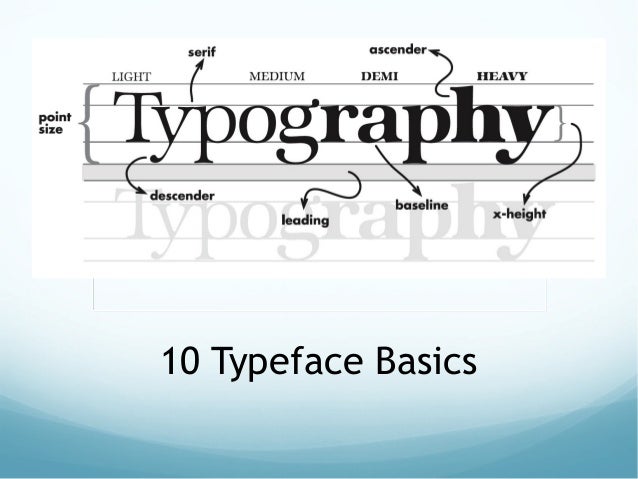
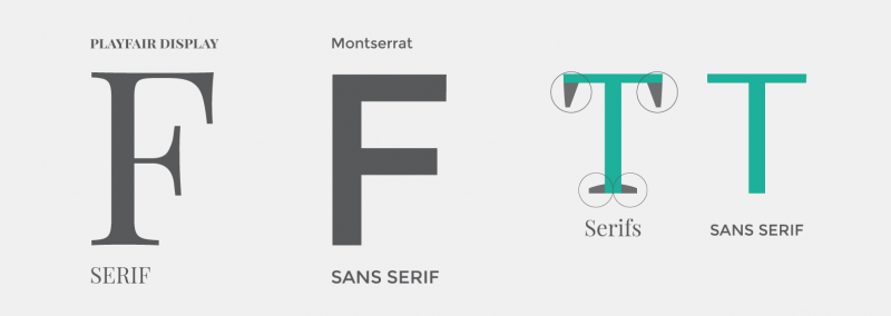
- Typeface: Family of graphic characters that usually include many type sizes and styles.
- The primary design.
- Exp: Serif, Sans serif
//有好几种typeface,主要认识serif和sans serif。 - Serif
- The little decoration at the end of a letter stroke.
- Often used for the body of the text for better readability.
- Exp fonts: Times, Times New Roman, Bookman
//字体有尖尖的,突出来的
- Sans serif
- Generally used for headings, signage, and other situations that need clear meaning but without the need of continuous reading.
- Exp fonts: Arial, Optima, Verdana
Fonts
- A particular implementation and variation of typeface.
- The implementation of design for a set of characters.
- Combination of typeface and design characteristics such as size, pitch, and spacing.
- Exp: bold, italic.
- Font Family
- A group of fonts that have similarities in design.
- Generally grouped into categories based on design specifications.
Computer Font
Two ways to represent fonts:
-
Bitmap Fonts
- Character is represented by an arrangement of dots.
- A font with jagged edges when enlarged, instead of a scalable font where no matter what the size, it looks the same.
- To print a bit-mapped character, a printer simply locates the character's bit-mapped representation stored in memory and prints the corresponding dots.
- Each different font, even when the typeface is the same, requires a different set of bitmaps.
- Exp formats: Portable Compiled Format (PCF)
- Advantages:
- Easy to place on the screen (Unscaled bitmap give exactly the same output when displayed on the same specification display).
- Extremely fast and simple to render.
- Best for very low-quality or small-size display where the font needs to be fine-tuned to display clearly.
- Disadvantages:
- Degradation in quality when zooming in.
- File size increases as more sizes are added.
- Requires large memory.
-
Vector/Scalable Fonts
- The shape or outline of each character is defined geometrically.
- Can increase in size without causing any degradation in the quality.
- Can be scaled to any size.
- Unlike bitmapped fonts, scalable fonts may be manipulated to generate characters of variable sizes without the use of a new file or set of characters.
- These fonts are stored as a series of mathematical expressions that define the curves and lines of the characters.
- Exp: PostScript and TrueType.
- Advantages:
- Scalability.
- Look better at higher resolution.
- No quality degradation when zooming in.
- Smaller file size than bitmaps.
- Disadvantages:
- Some look bad on low-resolution devices.
- Requires a powerful microprocessor to generate every character. to make it acceptably fast.

- Screen Fonts
- Fonts that used for screen displays.
- Many computer systems use bitmap fonts as screen fonts because vector fonts do not look very good on low-resolution devices (display monitors).
- Resembles the font of a document, so what you see on the screen will look very similar to the end result (printed document).
//要分清楚这两种font的好坏处,可能出题问:给一个情况,选哪种font最好。给出用这个font的好处和坏处之类的。
Hypertext
- Contains connections within the text to other documents.
//超文本:从一个text里附上的link(hyperlink),点击后跳转去别的文件。
#hypertext和hypermedia之前都有提过,可看回之前的笔记。
Hypermedia
- Provides a structure of linked elements through which a user can navigate and interact.
- Contains links to other forms of media: text, sounds, images, movies.
- Simply combines hypertext and multimedia.
//和hypertext一样功能,包含可跳转的hyperlink,但可以跳转更多不同媒体。
#更详细关于text的可看:https://www.slideshare.net/vanithachandru/textelements-of-multimedia
#值得阅读:https://slidetodoc.com/lecture-2-the-uses-of-text-in-multimedia/
以上就是text的知识,还剩下4个多媒体的element,而且每个都这么长又仔细又多东西要知道。这个subtopic也是我最恨的,因为太多东西要记了T^T
虽然考题不会出到太复杂,毕竟有分数限制。但也因为范围太广,导致出题有好几种方式,想要稳就只能尽量读得仔细点。而且multimedia还不一定会出~
-----------------------------------------------------------------------------------------------


没有评论:
发表评论